 |
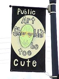
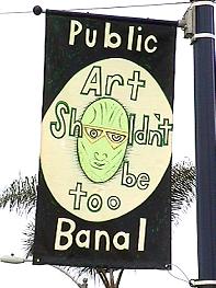
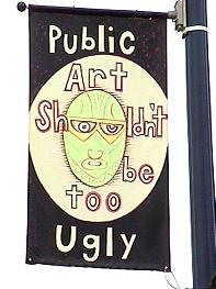
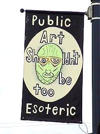
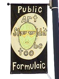
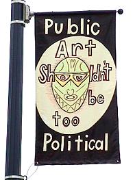
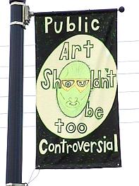
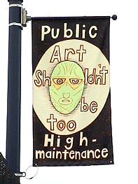
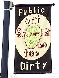
Public Art Shouldn't be too...by Wick Alexander When I was asked to participate in the banner project I immediately accepted. I know the community well and I liked the list of names of the artists also interested. I envisioned the artist-designed banners as an antidote to the banality and visual pollution, which other communities often display. The Super Bowl banners spread around San Diego were ugly and plentiful. The idea to have ten artists to create ten banners was intriguing to me. The big challenge was to make it art. This is always the big problem in public art. The debate about public art is an important issue in almost every metropolitan community. From my perspective, as an artist the demands set by the so-called public, make public art as art, almost impossible. The moment when the artwork is perceived as too colorful or too thought provoking or too anything, it will be rejected. My ten banners represent actual reasons why many of my public art proposals have been rejected. The ten banner slogans were selected from a larger list of rejections, which could easily have been included in this series. Here are some of them. Public art shouldn't be too... generic, dangerous, religious, personal, dicey, edgy, phallic, sharp, shiny, black, white, macho, gay, feminist, self-promotional, architectonic, big, strong, Mexican, didactic, normal, derivative, passionate, computerized, xenophobic, racist, etc., etc., etc. |
|
 |
|
|
 |
|
|
 |
|
|
| Ed. Notice: The public display of Alexander's 10th banner on Adams Avenue was rejected by the City of San Diego as being, well, "too....". The rejected art banner addressed the artist's problem of public officials rejecting certain proposed public works of art having a Mexican theme, based on their belief that "Public Art Shouldn't be too Mexican". Think about it.
|
|
